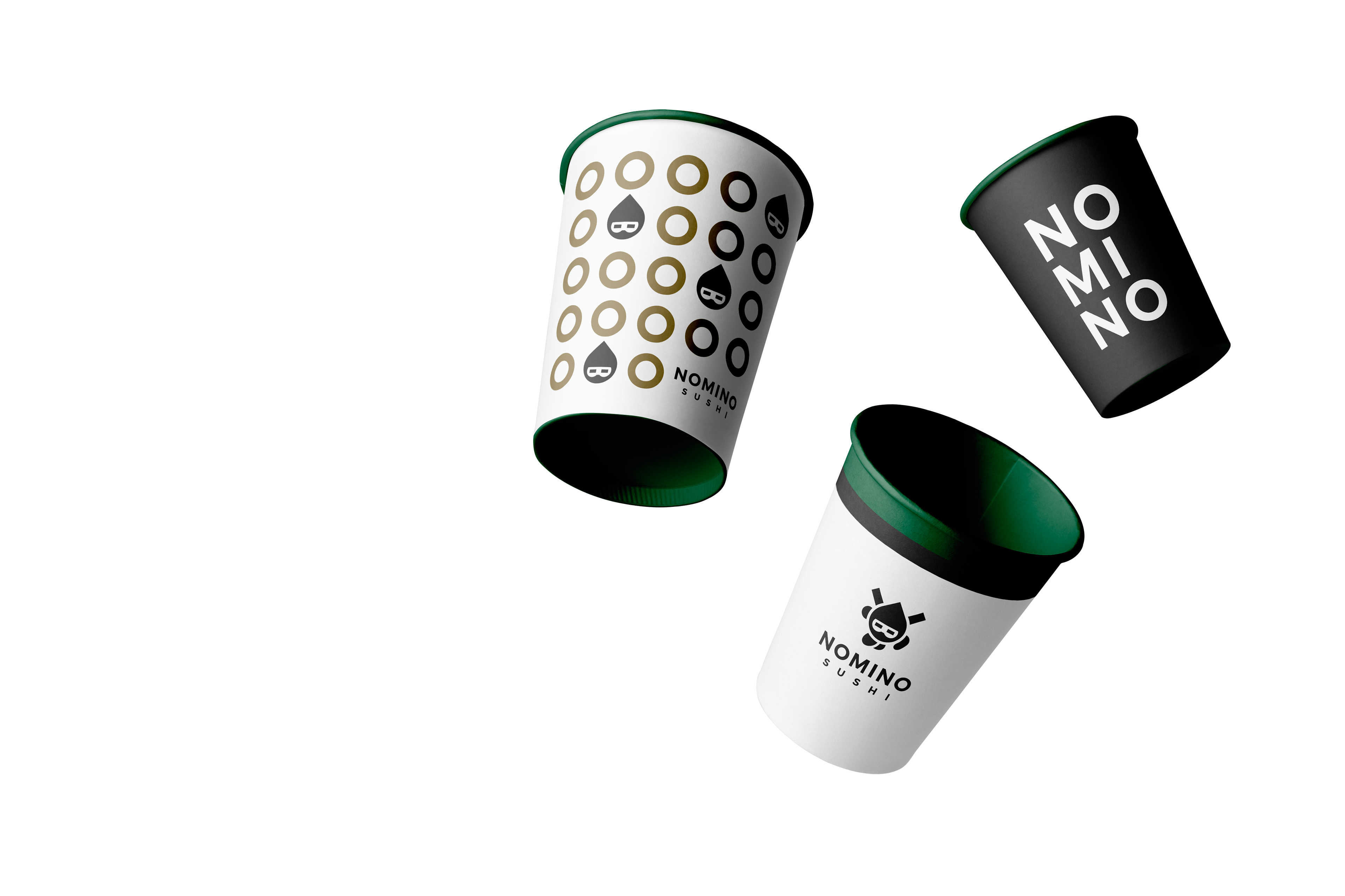
For Nomino, a Japanese restaurant breaking
the conventionalsushi-industry mold, I crafted
a distinct identity system that reflects its bold,
rule-defying nature.
the conventionalsushi-industry mold, I crafted
a distinct identity system that reflects its bold,
rule-defying nature.
The Challenge:
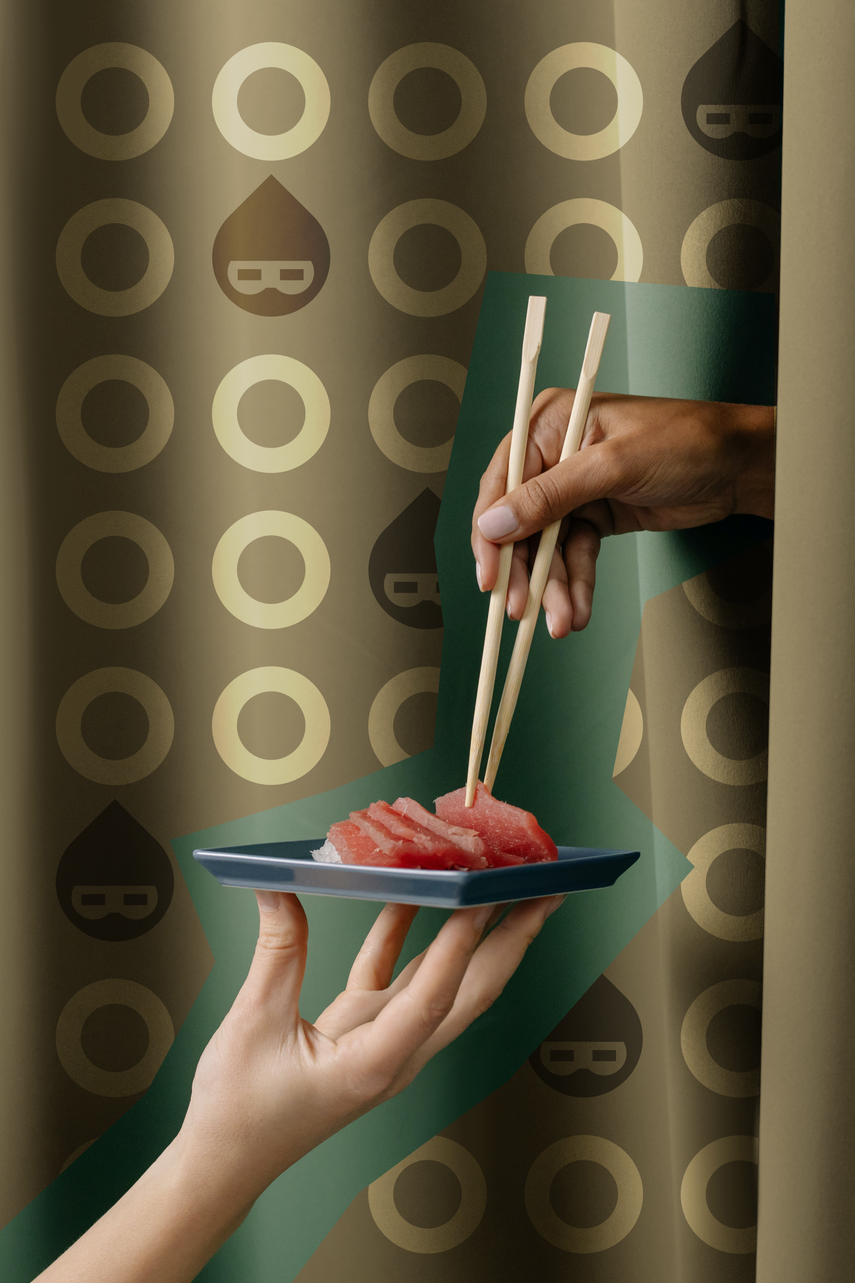
The design challenge was to represent Japanese culture
in a fresh, unexpected way, avoiding overused sushi clichés.
The design challenge was to represent Japanese culture
in a fresh, unexpected way, avoiding overused sushi clichés.

Solution:
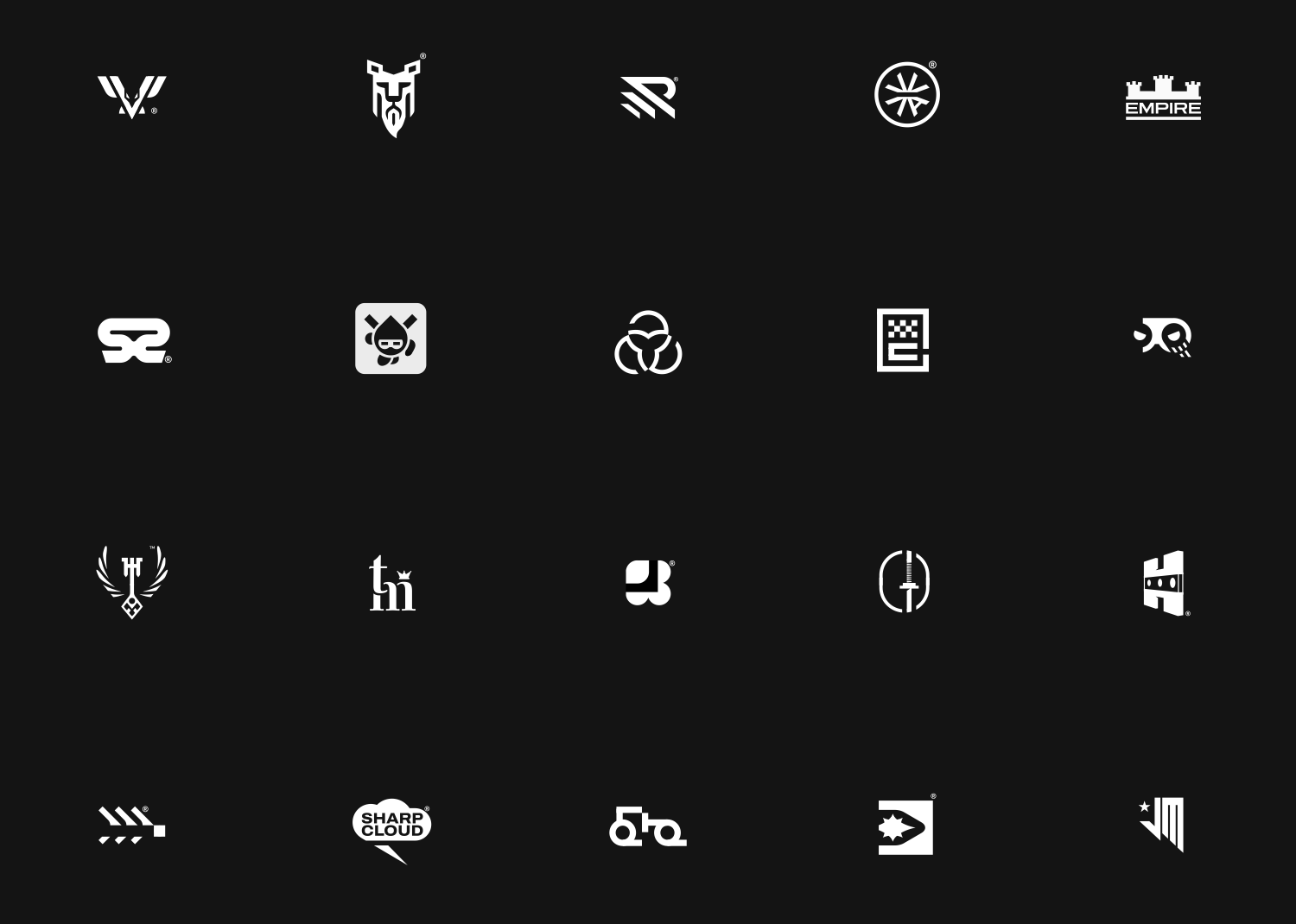
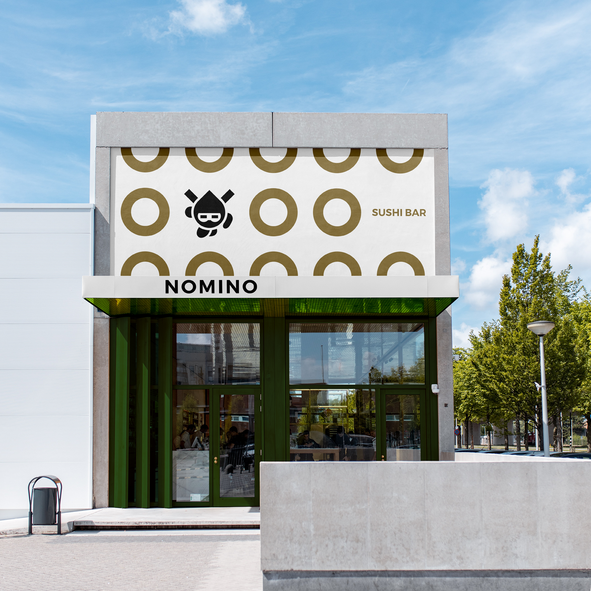
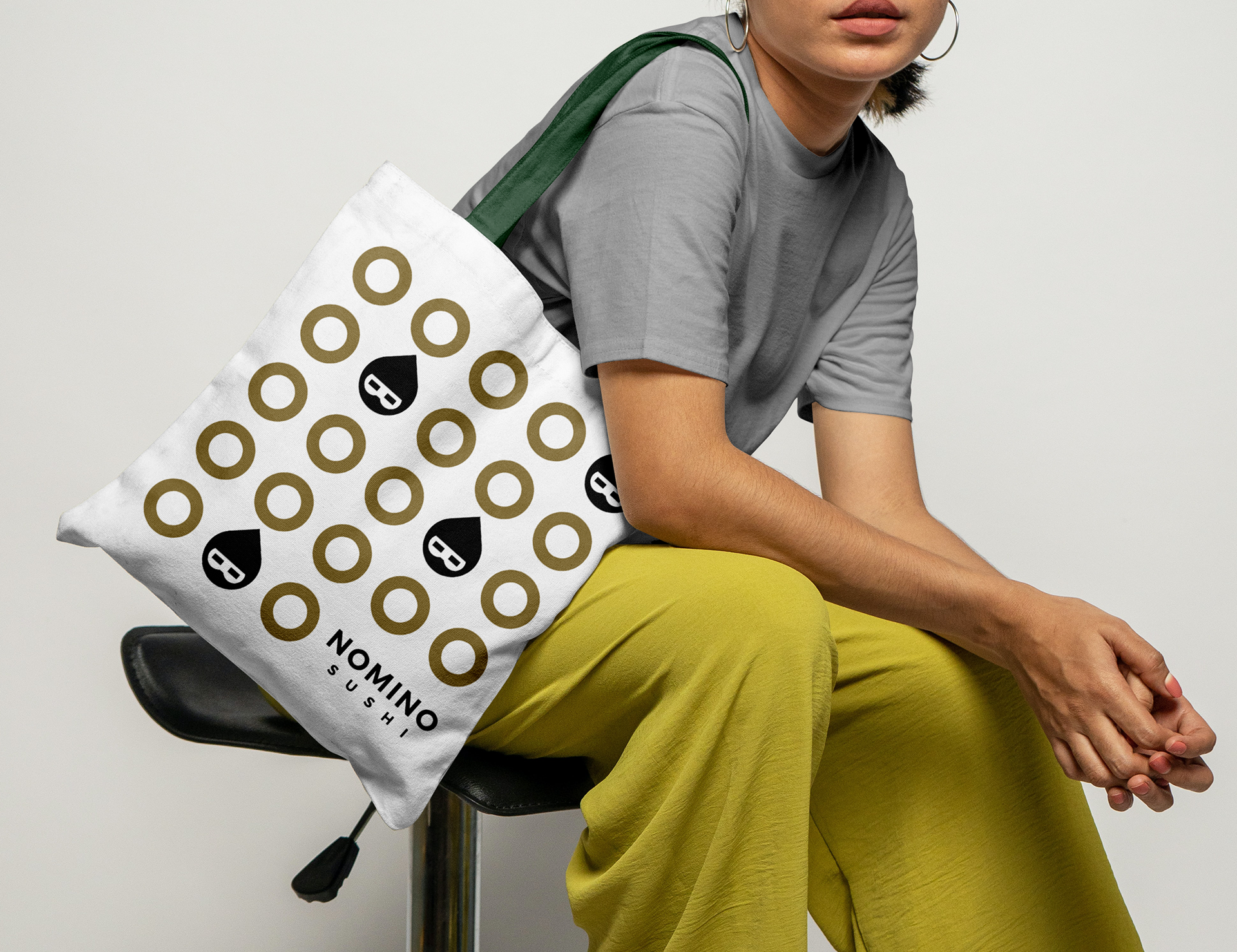
I developed a minimalist ninja logo in motion,
symbolizing agility and precision — qualities that resonate
with both the culinary craft and the brand's rebellious spirit.
The ninja's head, designed as a drop of soy sauce,
adds subtle cultural depth and an artistic nod
to traditional Japanese flavors.
I developed a minimalist ninja logo in motion,
symbolizing agility and precision — qualities that resonate
with both the culinary craft and the brand's rebellious spirit.
The ninja's head, designed as a drop of soy sauce,
adds subtle cultural depth and an artistic nod
to traditional Japanese flavors.
The Result:
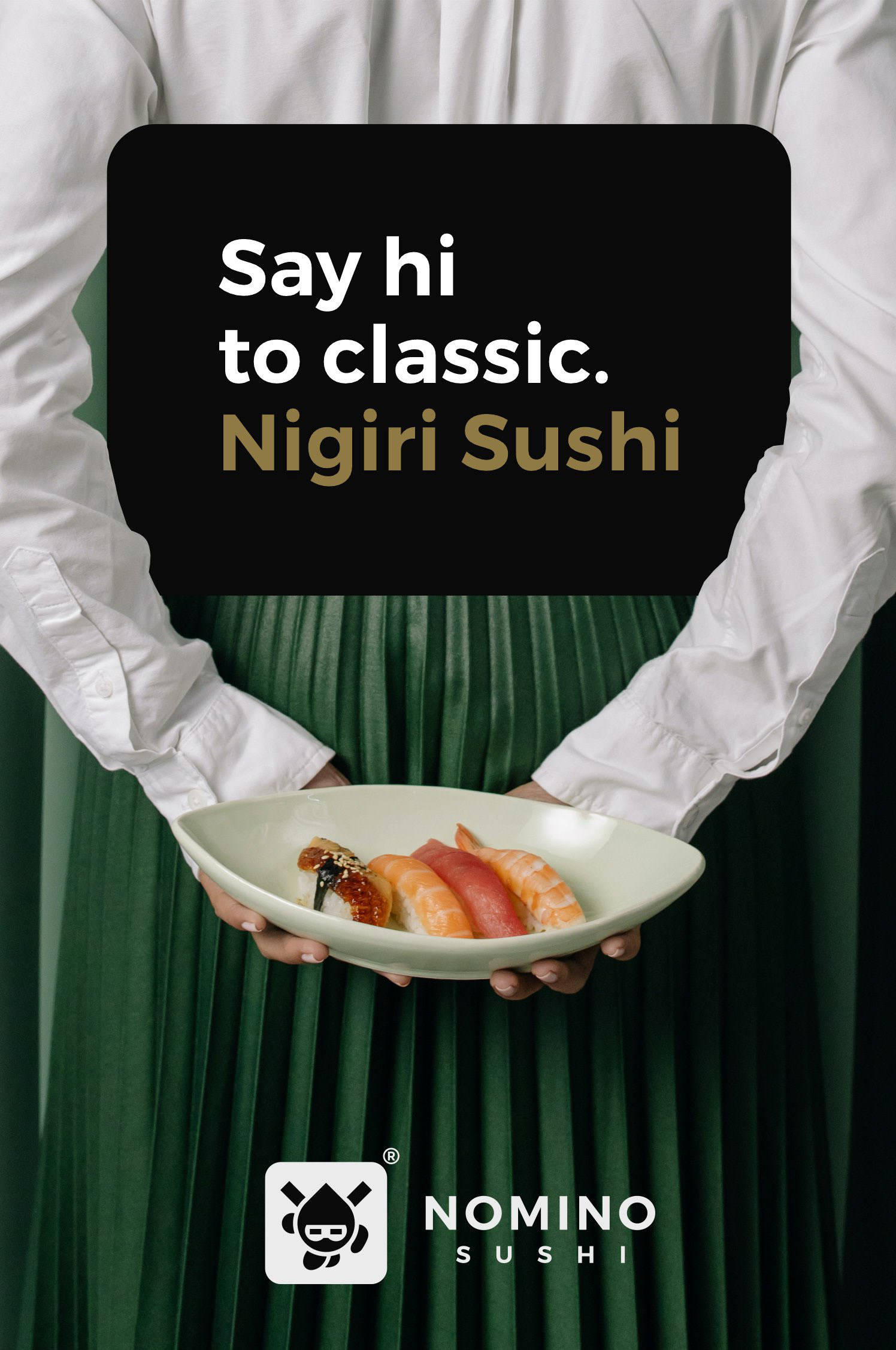
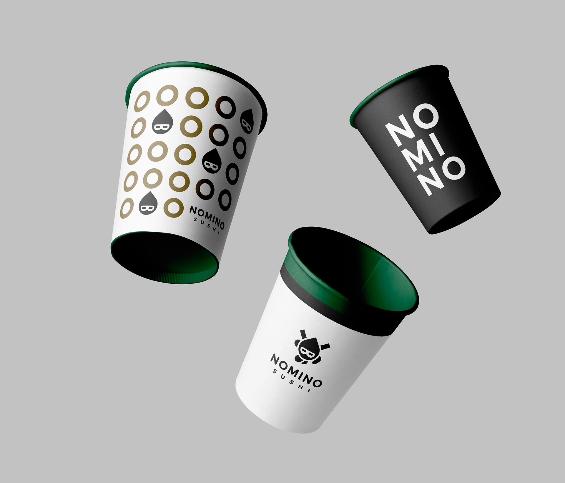
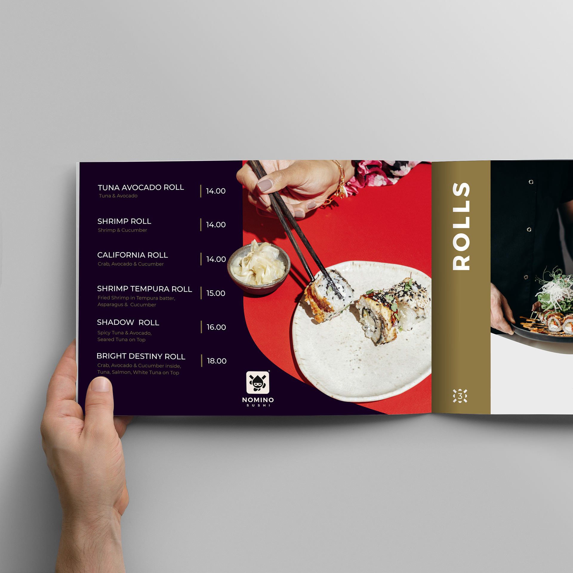
The brand palette combines bronze and green with classic black and white,
evoking sophistication with an authentic touch.
This color scheme supports the visual narrative, giving the brand a refined
yet edgy presence that stands out in the competitive restaurant industry.
The final result is a memorable, cohesive identity that embodies
Nomino's unique approach to Japanese cuisine.
The brand palette combines bronze and green with classic black and white,
evoking sophistication with an authentic touch.
This color scheme supports the visual narrative, giving the brand a refined
yet edgy presence that stands out in the competitive restaurant industry.
The final result is a memorable, cohesive identity that embodies
Nomino's unique approach to Japanese cuisine.